Fitted.
A responsive web app for those who want regular exercise in their life but don’t know where to start.
I built Fitted over 2 months (part time) as part of my “UI for UX Designers” course with Career Foundry.
-
Role.
UI/ UX Designer
The research aspect of the project had already been completed and handed over to me.
-
Tools Used.
Figma
Marvel
Adobe Photoshop
Adobe Illustrator
-
Problem.
It is hard to exercise, when you don’t feel like you have enough time or even know what exercises you should be doing.
-
Solution.
By having a range of exercises to choose from and a way to filter by time, type and level. It is easy to find exercises to fit into your schedule.
My Design Process:
-
Understanding
User Persona
-
Ideate
User Stories
Key Features
User Flow
Rapid Wireframing
-
Design
Lo-fi Wireframes
Moodboard
Typography and Colour Palette
Imagery
Breakpoint Design
-
Handover
Style Guide
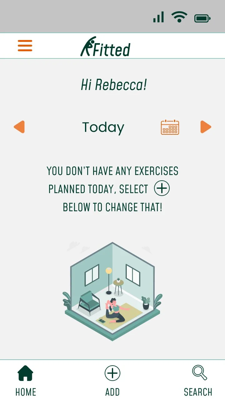
UI Mobile Mockups
Prototype
UI Breakpoint Mockups
Presentation Mockups
I used a mobile first approach when designing Fitted. This method helped me categorise elements and consider what was essential to make it a functional app. By prioritising primary over secondary elements, it allowed me to keep Fitted from becoming cluttered.
It also made it easier when considering breakpoints at a later stage.
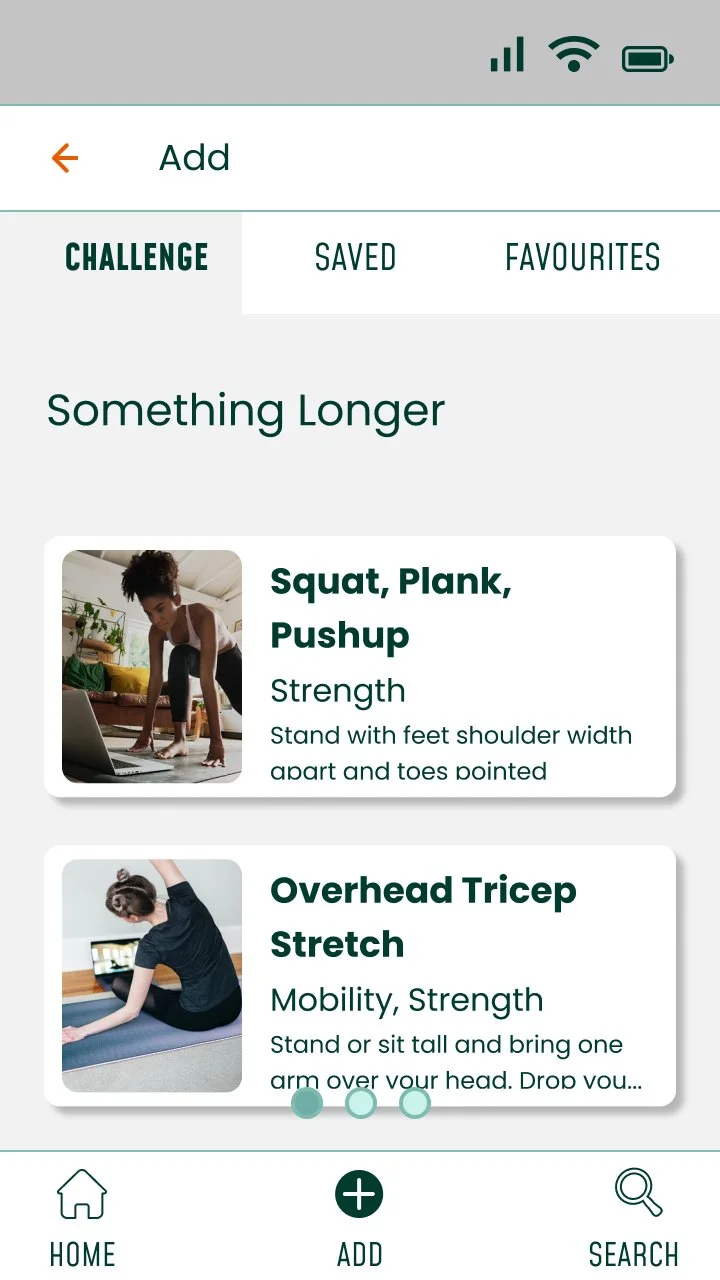
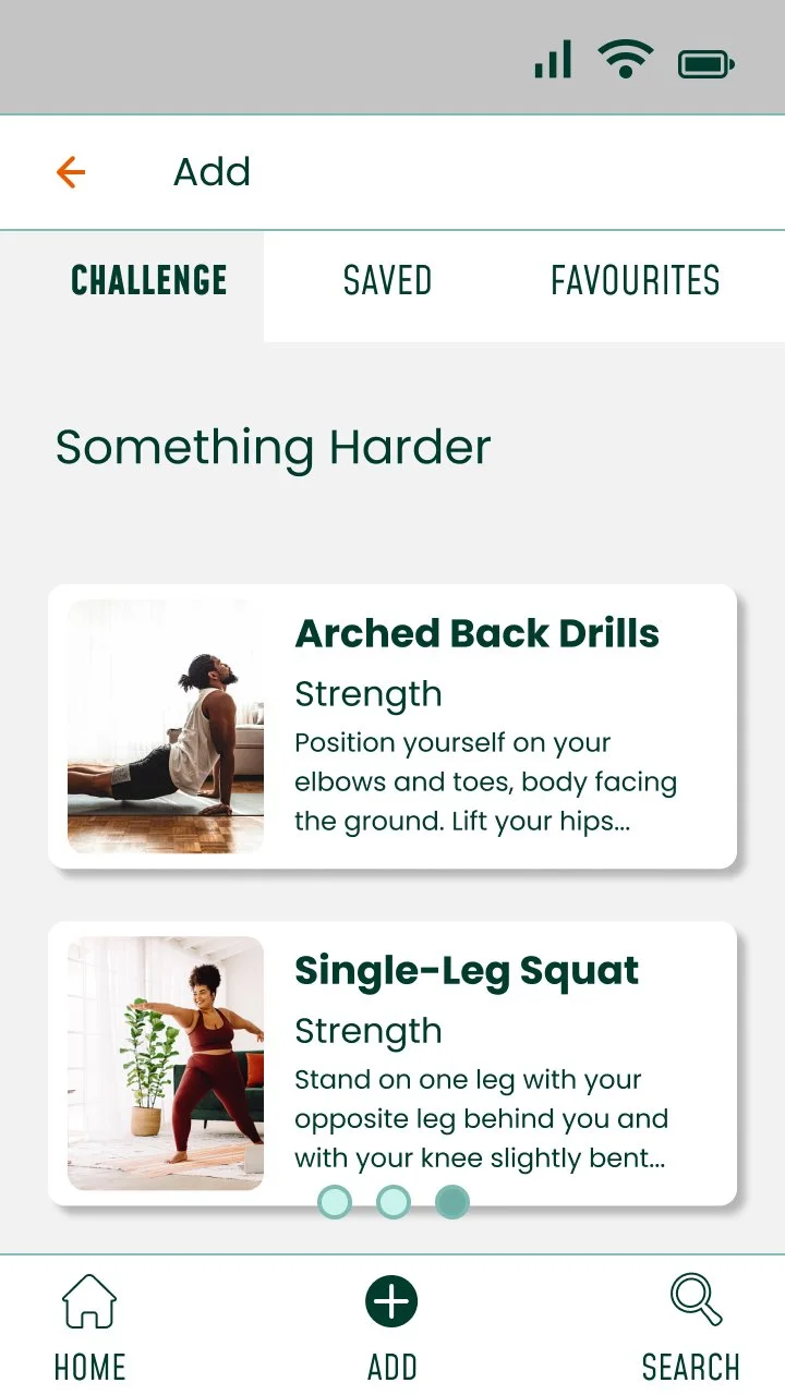
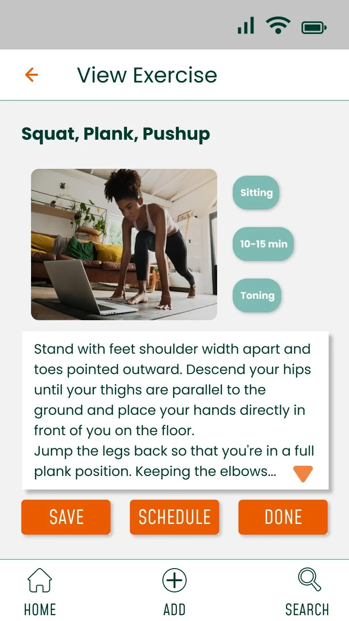
Visual Summary of Design Journey.
Mobile Wireframes
Documentation
Understanding.
Meet Rebecca.
As I had not carried out the research stage myself, it was important to make sure I have reviewed the handover documentation and understood the aims of this project and who I was designing for. The user persona was important for this.
Ideate.
Rebecca’s user stories helped me formulate key features of the app and then I mapped out user flows to show the path that a user would follow to complete a task.
This was an important step to complete before moving on to wireframing as it allowed me to visualise the different screens required.
Key Features and User Stories.
-
As a new user, I want to learn about different exercises, so that I can figure out what is best for me.
Exercises will be shown on a card with an image and description that is easy to view.
By being able to filter and review available these cards, Rebecca will be easily find exercises that appeal to her.
-
As a frequent user, I want to be able to schedule exercises for working out, so that I build positive habits.
As a frequent user, I want to track progression and record what I’ve done, so that I can see my progress over time.
Exercises can be scheduled and viewed. This allows for tracking progress over time will will help with motivation.
-
As a frequent user, I want to complete daily challenges, so that I can have an additional way to stay motivated.
By offering Rebecca a variety of challenges and achievements for completing these and other milestones, it will add a level of motivation.
Rapid Wireframing
Design.
Lo-fi Wireframes.
I moved from paper onto Figma:
defined grid and layout.
transferred from paper to screen and identified the main UI components.
assessed design in regards to visual hierarchy and principles of good spacing.
Evolution of the home page:
Mood Boards.
-

Nurture, Heart and Home.
Key Words: bright, clean, modern, home, family, plants.
Tapping into the working from home mentality.
-

Retro Dance/ House Party
Key Words: retro, music, vibrant, bright
Tapping in to the nostalgia from Rebecca’s demographic to make the thought of exercise fun.
Rationale:
Across both boards I was keen to include realistic pictures that do not show only very fit people. I avoided showing people with expensive and bought equipment.
By only showing people using items that could be found in their home to exercise, this would appeal to users with a wider range of financial backgrounds as it reflects no need to buy extra equipment.
When I was researching this the Retro board, it was hard to find a range of pictures and phrases to capture the mood adequately and I realised that this mood is actually very limiting. It is not very flexible and you end up very trapped by its principles. It may not appeal to users all of the time which would lead to poor use.
With Nurture, Home and Heart, it is simple and will not ostracise potential users. I felt that even though Rebecca might have fun with the Retro board, Nurture, Home and Heart is where she is now. It is calm and consistent which is what is required for an app which will be frequently used.
Typography.
I chose two fonts:
The first one Mohave, has a modern feel to match the mood board I selected. I used it for the Logo but also in all caps for the text which is used in a more functional manner; buttons, tabs, menu options- anything with a call to action.
As Mohave is not very easy to read in larger blocks of text, the second font I have chosen was specifically for headings, cards and anywhere where the user is reading as opposed to selecting. I used Poppins for this as it is wider spaced, making reading easier.
Colour Palette.
Imagery.
It is really important to me for users to see themselves in apps that they use, especially when trying to encourage and maintain use, therefore any images used should:
Feel “real”, not staged.
Include a diverse range of people including different body types and ethnicity.
Not include unrealistic body images
From a practical point of view, for exercise demonstration purposes only real images should be used and there should be a clear view of body movements.
-
Logo Design and Iconography.
-

UI Elements.
Once the colour palette and iconography had been completed, I could finalise the UI elements.
This was a very satisfying process.
Design for Different Breakpoints.
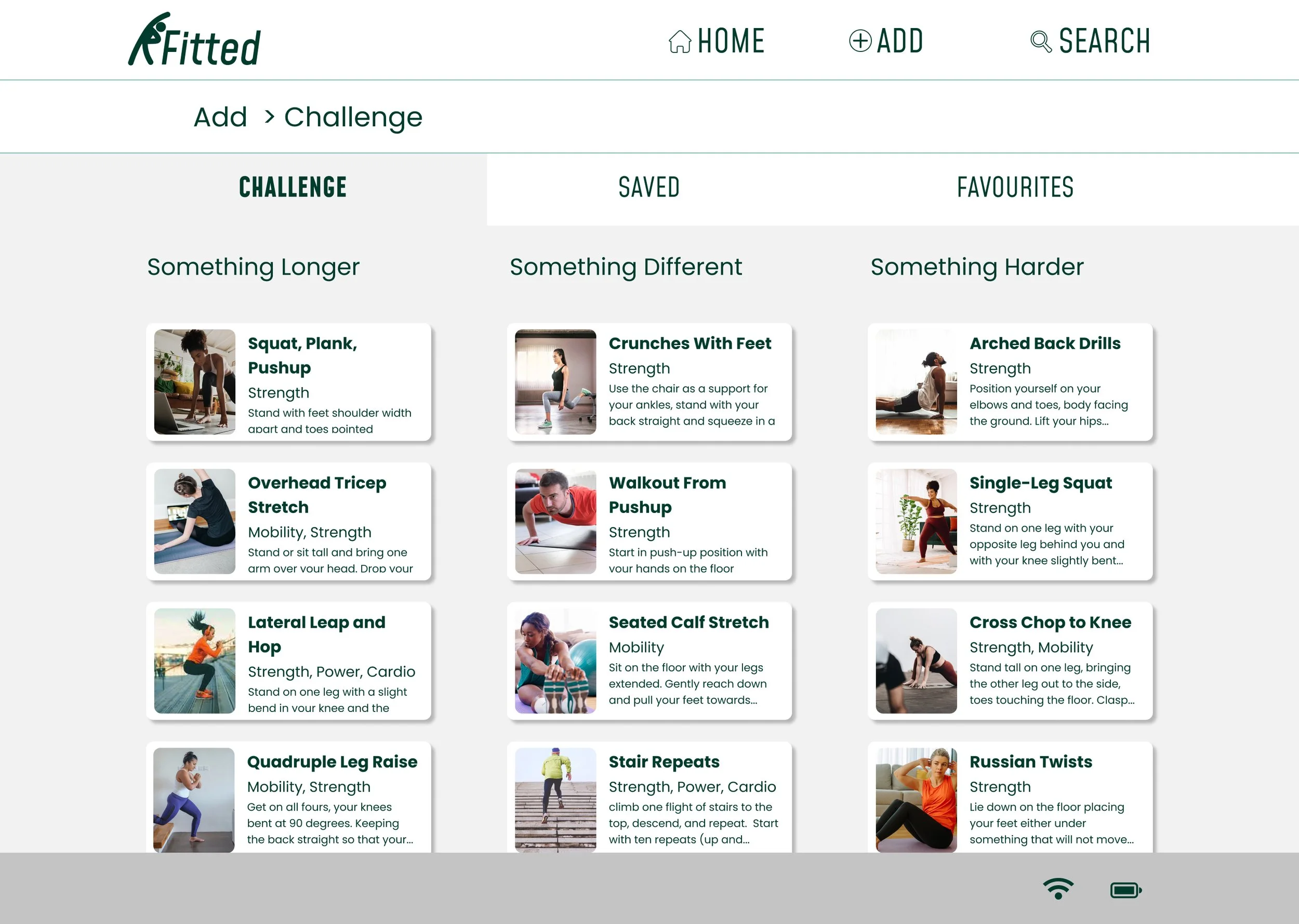
As I had used a mobile first approach, when it came to designing for different breakpoints, I used progressive enhancement to add to my tablet and desktop designs. There was more space, so I was able to make more content available in one go and by using a mostly fluid approach, my UI elements could be rearranged rather than have to be redesigned.
Home Page Desktop Design
Home Page Tablet Design
Gestures in Action.
Handover.
Fitted Style Guide.
UI Mobile Mockups and Prototype.
Breakpoint Mockups, Tablet.
Breakpoint Mockups, Desktop.
Presentation Mockups.
Conclusion.
Before actually handing over for development, user testing should be carried out across all breakpoints to ensure the ability to carry out tasks is the same.
User testing was not carried out as part my process in this instance as the focus was on developing my UI skills. I found that I missed this level of input as having data to back up design decisions made makes me feel reassured in my choices. In this case, I relied on my mentor for feedback to lead in choices instead.


